

Most wayfinding fails quietly. Nobody files a complaint that says "your signage cognitive load was too high." Instead you get a stewards' radio channel jammed with "where's the north entrance" questions, a med tent that people can't find, and a merch line collapsing into the main flow because the last directional sign was placed too late for anyone to react.
The frustrating part is that the signage was there. Someone printed it, someone hung it, and it still didn't work. That gap — between installed and effective — is almost always a spec problem, not a design problem. The graphics were fine. The placement math wasn't.
This is a spec for treating event wayfinding systems as an operational system with rules you can measure against, rather than a last-week scramble handled by whoever has a ladder. It covers sightline geometry, how far apart signs can actually be before a person loses the thread, a reusable inventory template, modular placement patterns, and messaging cadence rules that keep attendees oriented without frying their attention by hour three.
Why signage that looks complete still fails
Walk a venue at 10am on build day and everything looks covered. The problem is that build-day walkthroughs happen with empty sightlines, no crowd, no sun angle, and no fatigue. The person evaluating the signage already knows where everything is.
A few patterns show up over and over:
-
Signs placed at decision points that are already behind the decision. A directional arrow to the food court that sits at the food court entrance is useless. The decision to turn happened 40 feet back, at the junction, where there was no sign.
-
Eye-level assumptions that don't survive a crowd. A-frames and low banners work in an empty concourse and disappear the moment there are three rows of people between the attendee and the sign. In dense flow, anything under about 7 feet is functionally invisible.
-
Message overload on the first sign someone sees. Eleven destinations listed on one board. People scan the top two lines and give up. The sign technically contains the answer, but nobody's going to find it.
-
No redundancy across the path. One sign per turn means one missed glance equals a lost attendee. If a person is talking, looking at their phone, or blocked by a tall guy in a poncho, that single sign never happened for them.
The through-line: signage gets planned as coverage ("did we sign every area?") instead of sequence ("can a person moving through the space stay oriented the entire way?"). Coverage is a checklist. Sequence is a system.
The sightline math that actually matters
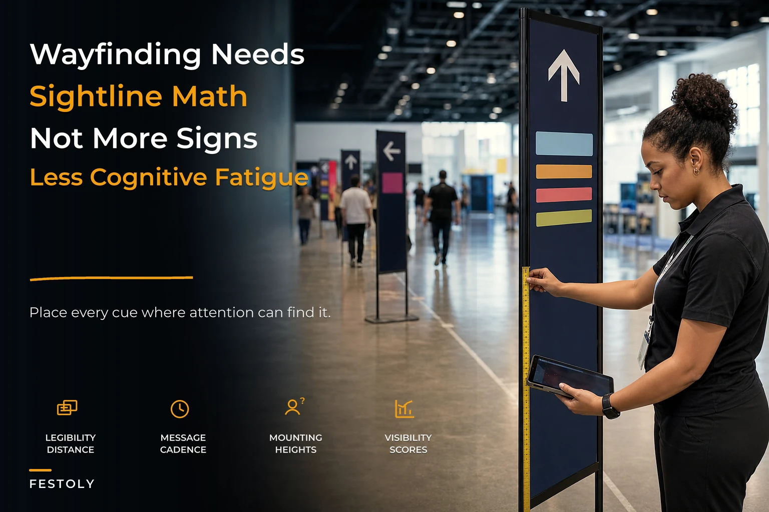
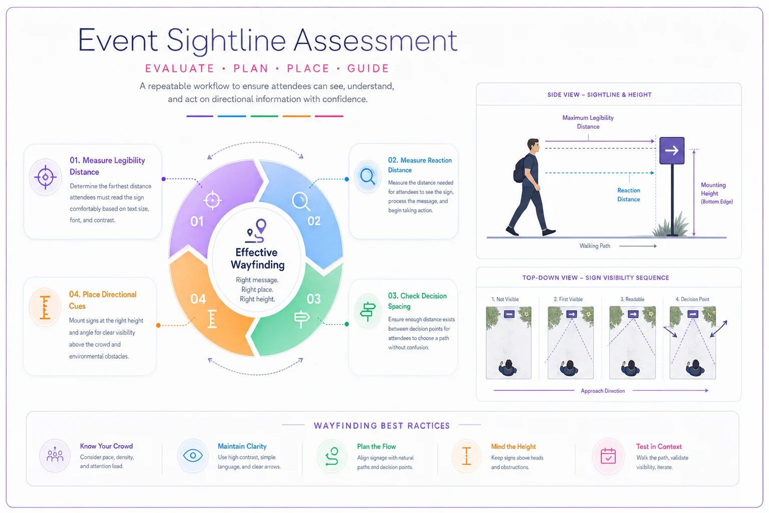
You don't need surveying equipment. You need three numbers and the discipline to walk the path at eye level.
Eliminate event chaos with Festoly.
Manage every aspect of your event seamlessly — from planning to execution.
- Centralized event scheduling
- Real-time attendee tracking
- Vendor & resource coordination
No credit card required
1. Legibility distance. The rough working rule is about 1 inch of letter height per 25–30 feet of reading distance for a sign someone needs to read while moving. So a directional sign meant to be readable from 100 feet out needs cap height in the 3.5–4 inch range, minimum. People consistently under-size text because they design at desk distance where 2-inch letters look enormous.
2. Reaction distance. A person walking at a normal pace covers roughly 4–5 feet per second. If they need to read a sign, process it, and change direction, they need something like 3–4 seconds of lead time before the junction. That's 15–20 feet of clear sightline before the decision point, minimum. Place the sign so it's readable at least that far out.
3. Decision spacing. The distance between "I can no longer see the last sign" and "I still can't see the next one" is where attendees get lost. That gap should be near zero on primary paths. Practically: the next directional cue should become visible before the previous one leaves useful range.
A quick visual workflow for applying the sightline numbers on a path.
| Path type | Max gap between directional cues | Min cap height | Mounting height in crowd |
|---|---|---|---|
| Primary artery (main flow) | 75–100 ft | 3.5–4 in | 8–10 ft (overhead preferred) |
| Secondary path | 100–150 ft | 2.5–3 in | 7–8 ft |
| Low-density zone | 150–200 ft | 2–2.5 in | eye level acceptable |
| Decision junction | sign visible 15–20 ft before turn | 4 in+ | overhead or double-sided |
Those aren't laws of physics — venue lighting, color contrast, and background clutter all move the numbers. But if you're placing primary-path signs 250 feet apart at eye level with 2-inch text, you already know it's going to fail and now you know why.
Building a signage inventory template that survives multiple events
The single biggest time-saver isn't better design software. It's a signage inventory that treats every sign as a tracked object with a location, a purpose, and a lifecycle — so you're not rebuilding the entire wayfinding plan from scratch each event.
A workable inventory template has one row per physical sign and these columns:
-
Sign ID — a short code like
PRIM-N-04(primary path, north, fourth in sequence) -
Path / zone — which artery or area it belongs to
-
Type — directional, identification, regulatory, informational
-
Message — exact copy, so nobody reprints "restroom's" by accident
-
Mount type — A-frame, overhead truss, wall vinyl, feather flag
-
Sightline note — what it needs to be visible over/around ("readable from main gate," "clears the merch tent")
-
Install owner — the specific person or crew, not "signage team"
-
Placement photo — a reference shot from a prior event
The last two columns are what make it repeatable. When the same person can pull up last year's placement photo for PRIM-N-04, the build-day install collapses from a guessing game into matching reality to a reference. Across recurring events, this is where an hour of chaotic radio traffic per morning quietly disappears.
Keep the Sign ID format consistent across queue, directional, and exhibitor signage so the same code maps to one physical location every year.
This inventory also connects directly to two other systems you're probably already running. Your queue signage should share IDs and language with your directional signage so a person moving from the entrance line into the venue doesn't experience two different visual vocabularies — the geometry-driven approach in Queue Management for Events pairs naturally with a sightline spec because both are really about controlling movement through space. And exhibitor-facing wayfinding — booth numbers, hall directories, sponsor callouts — should tie into the same tracked inventory rather than living in a separate exhibitor packet, which is exactly the kind of milestone-linked coordination covered in the Exhibitor Operations Framework.
Modular placements: stop designing every event from scratch
The mistake at small and mid scale is treating each venue as fully bespoke. Venues differ, but the placement patterns don't. There are only a handful of situations you're actually solving for, and each has a standard module.
The gateway module. First 30 feet after any entrance. This is where you set orientation, not detail. One large overhead identification sign ("Welcome — Main Concourse") plus a single primary directional that answers the top two questions people have on arrival (usually restrooms and the thing they came for). Resist listing everything. The gateway's job is to reduce panic, not to be a directory.
The junction module. Any point where the path splits. Every branch gets named, placed overhead or double-sided, visible from the reaction distance discussed earlier. If a junction has three branches, all three appear on one clean board, ranked by traffic volume, not alphabetically.
The reassurance module. On long straight runs, people start to doubt they're still going the right way. A small confirming sign every 150–200 feet ("→ Food Court, 200 ft") prevents the U-turn that clogs the artery. These are cheap and skipped constantly, and their absence is exactly what generates "am I going the right way" foot traffic backward into the flow.
The destination module. Arrival confirmation plus any regulatory or operational info (hours, rules, no re-entry). This is the only module where higher message density is acceptable, because the person has stopped moving.
Once these four modules are defined, planning a new venue becomes assembling modules along the traffic paths instead of inventing signage. A festival that took two days of signage planning drops to a few hours because the question shifts from "what signs do we need?" to "how many junctions, arteries, and destinations does this map have?"
Messaging cadence: the fatigue problem nobody plans for
This is the part almost every plan ignores. Signage isn't only about geometry — it's about attention over time. A person entering at 11am has full cognitive capacity. By 3pm, after heat, noise, walking, and a hundred micro-decisions, that same person reads far less and processes slower. If your signage assumes fresh attention everywhere, it degrades exactly when the crowd is largest and most tired.
Fatigue-minimizing cadence comes down to a few rules:
-
One job per sign. A sign that directs and advertises and lists rules does none of them well. Directional signs point. Informational signs inform. Never merge.
-
Consistent visual grammar. Same color for directional, same for regulatory, same arrow style throughout. Once a person's brain learns "yellow means where-to-go," every yellow sign becomes a half-second glance instead of a full read. Break that consistency and every sign resets to a full read.
-
Front-load the hard decisions. Put the complex routing near the gateway when attention is high. Keep late-path signage — near exits, late-day activations — dead simple.
-
Cap simultaneous choices. No sign should present more than about four options at once. Beyond that, scan time jumps and people default to asking a human, which is the failure state.
-
Repeat, don't restate. Reassurance signs should use the identical wording as the junction sign that sent them there. "Food Court" at the junction and "Dining" halfway down reads as two different places to a tired brain.
The cadence rule that matters most: the total number of signs a person must read to get anywhere should stay flat as your event grows. Bigger event, more area, more destinations — but the individual attendee's reading load should not climb. If it does, you've scaled the map without scaling the system, and fatigue does the rest.
A real scenario: a two-stage regional food festival
A regional food-and-music festival, roughly 12,000 attendees across a day, two stages, around 40 vendors, spread over a converted fairground. Signage designed the usual way — cover every area, hang it on build day.
The symptoms were predictable. Stewards reported the same three questions all day: where's the second stage, where are restrooms, where's the ATM. The path between the two stages had a single directional sign at the fork, at eye level, that vanished the moment the crowd thickened. People kept doubling back through the main artery to re-find the fork, which created a slow counter-flow collision right where density was highest.
The rebuild didn't add much signage — it re-sequenced it. They mapped the actual traffic arteries, defined the four modules, and rebuilt the inventory with sign IDs and placement photos. The stage-to-stage path got overhead directionals at the fork plus two reassurance signs on the long run. Restroom signage moved to overhead at every junction with consistent iconography instead of scattered A-frames. The gateway board was cut from nine listed destinations to three.
The measurable shift the next year: "where is X" radio traffic dropped noticeably — stewards estimated it roughly halved during peak — and the counter-flow jam between stages effectively went away because people stopped reversing course. Total sign count went down by around 15%. It wasn't more signage. It was signage that respected sightlines and tired brains.
When a full sightline spec is worth it — and when it isn't
When it makes sense:
-
Recurring events where the inventory pays off across cycles
-
Anything over a few thousand attendees where crowd density kills eye-level signage
-
Multi-zone or multi-stage layouts with real routing decisions
-
Venues you'll return to, where placement photos compound in value
When it's overkill:
-
A single small room or a one-hallway conference where line-of-sight already covers everything
-
Tightly bounded spaces where a person can see every destination from the entrance
-
One-off pop-ups too small to justify building the inventory template
Organizers running intimate events under a few hundred people in a space you can visually take in at a glance don't need this. At that scale, a couple of clear signs and a staffed info point beat any spec, and building the template is effort you won't recover.
Making it repeatable without living in a spreadsheet
The reason wayfinding stays chaotic isn't that planners don't know better — it's that the knowledge lives in one person's head and evaporates between events. The inventory template, the sign IDs, the placement photos, the module definitions: these are what turn one good build into a repeatable system.
This is also where keeping the wayfinding inventory inside the same operational platform you use for site mapping, staffing, and build schedules starts to pay off. When each sign is a tracked item with an install owner, a location, and a reference photo — instead of a line in someone's notes — the same AI-assisted operational tools that flag staffing gaps or schedule conflicts can flag a junction with no directional cue, or a primary artery whose sign spacing exceeds the range you set. Not as a gimmick, just as one more consistency check that would otherwise depend on someone remembering to walk the path at eye level. The point isn't automation for its own sake; it's that the placement discipline survives staff turnover and grows with the event instead of resetting to zero each year.
Get the geometry right, respect that attention runs out, and treat every sign as a tracked object with a job. Do that and wayfinding stops being the thing you scramble to finish on build morning and becomes one of the quietest, most reliable parts of your operation.
Ready to elevate your event management?
Join 5,000+ event organizers using Festoly to save time, improve coordination, and deliver memorable experiences.